Sunday Sketch
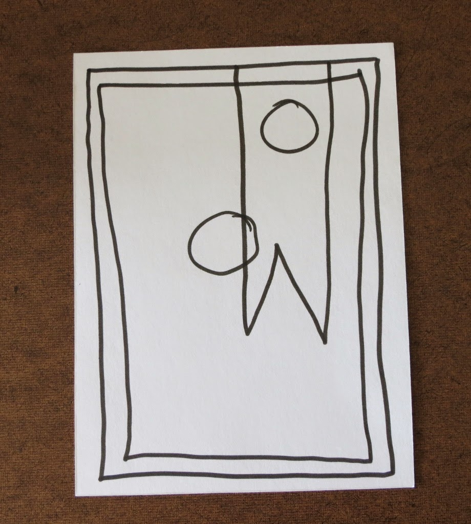
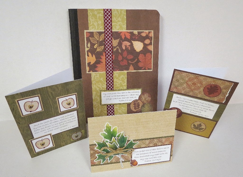
I've only done cards with "ribbons" on them a couple of times, but I really like they way the paper strip looks on this sketch. (Please don't mock my drawing this time - I'm not the best draw-er of ribbons in the world.) On this sketch, you'll have a solid color as the background and a busier print pattern on top. The paper strip will have a notch cut out of the bottom to make it look like a ribbon and will be made from a lighter color so the phrase stands out. Let your imagination run wild with the embellishments. You'll want them to be a little bigger than normal so they'll stand out against the busy patterned paper and the plain-ness of the paper strip. For my card, I used a very neutral color for the background and a textured autumn decorator paper on top of it. The paper strip has some texture to it, too, and has a notch cut out of the bottom to make it look like ribbon. (Just cut a square of paper and use it as a template.) I used vell...
