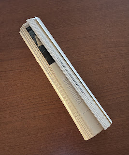
Secrets Of The Rolled Up Magazine Revealed
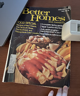
In March 1972, a magazine like Better Homes and Gardens cost 50 cents. That fact alone blew me away when I found this magazine in a box with some vintage Christmas decorations. That and the amazing color and lighting in the cover photo. The vintage look (which was modern at the time) is so classic that you can tell what era it is from with just a quick glance.
And there it was, wrapped up in a table runner to keep it wrinkle-free. I definitely wasn't expecting an issue from before I was born, but it turned out to be a time capsule of goodies on every page.
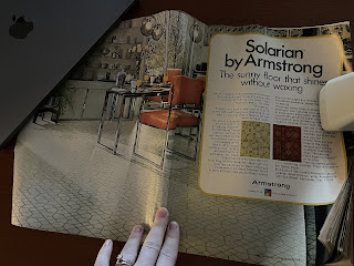
The fun started right inside the front cover. Check out the pattern in the flooring paired with those amazing, red, retro chairs. That sleek look and classy lighting fixture are trending again, so it's true when they say that what goes around, comes around. Also note that the flooring surface repels stairs, food and dirt. How novel!
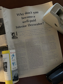
The design of this page made interior design school seem like an article about possibilities instead of an advertisement. The LaSalle Extension University would only be open for 10 more years when this ad was placed, but no one knew that at the time. How neat for us to know the future as we look back in time. Plus, who wouldn't want to learn to be a well-paid interior decorator?
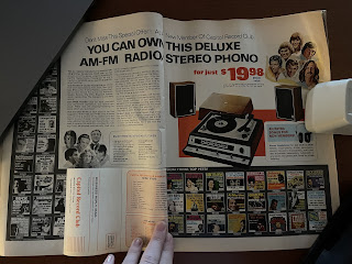
Have you seen how hip and happening vinyl records are again? Imagine being able to join a full-service record club, earn free records and have the coolest musical technology on the block! The Capitol Records Club let you pick albums from your favorite genres and have 12 sent to your home over a two-year period. It's Book of the Month, but with records!
This page is just a reality check. Even in the 1970s, we were concerned about rising health care prices. Maybe $75 is why we call them the Good Old Days.
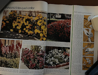
And it wouldn't be a home and garden publication without some landscaping advice. I remember my house growing up having those beautiful marigolds everywhere, and I wonder if the tips are just as effective and pertinent today as they were 50 years ago.
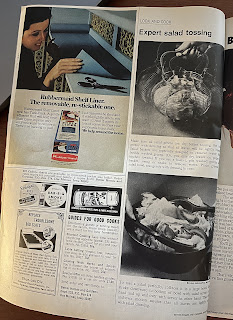
Ok, I just have to tell you - I want this salad tosser! I have never seen this kitchen gadget before, but I love it. I'm a big fan of vintage kitchenware anyway, but I can't think of anything more fun than spinning the salad until it's completely dizzy. Maybe that's just me.
If there's a practical take-away from this magazine, it's the pages of recipes that start about halfway through. I've made my next grocery list with the ingredients for the manicotti and the meatballs. We have a local grocery store that pre-mixes ground pork, beef and veal, so that will save me a ton of time and energy! I'll let you know how they turn out.
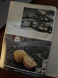
Oh my goodness, I love fondue. Before we moved back to Iowa, there was a fondue restaurant we frequented that had a three-course fondue meal - appetizers, meat and dessert. I love that the magazine creators wanted to help me do it at home. Fondue party, anyone?
I also have to try this shrimp recipe to see if it still holds true. Shrimp tempura is one of my favorites, and adding vegetables to the fry mixture sounds amazing. I don't usually fry at home, but I'd be willing to make an exception for this.
There are many things I love about this ad. First, they want me to shape up. Second, they want me to drink a large glass of grapefruit juice every day. Third, they think I'm staying up until 11 p.m. Fourth, they think I'm going to go to bed after drinking all that juice. Fifth, I want that multi-level game board. Everything about this page is absolutely phenomenal.
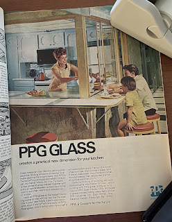
And lastly, who doesn't want a window in their kitchen? Not just over the sink so you can look out while you wash dishes, but all along two walls so you can serve to the people outside while you cook and prepare inside. I'd be curious about how many homes of the time had these pass-through windows, and how many still have them. The passage of time may change some things, but not the desire to make your home better for your family.






Comments
Post a Comment